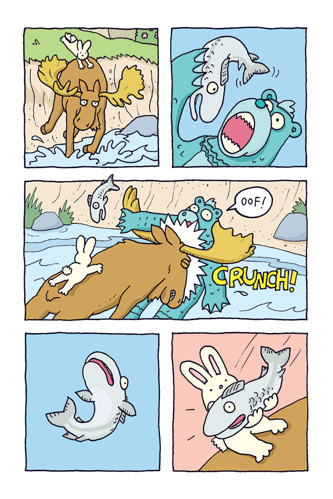
 Now that Laser Moose and Rabbit Boy: Time Trout is out there in stores, I thought I’d write up a little post about my process for creating each page. Here’s how I created page 75 of the new book, which features Laser Moose and Rabbit Boy saving Trout from the clutches of Aquabear…
1. The Script
Before I draw much of anything, I write the script for the book. I send this script to Jean, my editor at Andrews McMeel Publishing, and she sends me notes about it. I try to be as detailed as possible, so that Jean can picture what I will eventually draw. And it helps me do the drawing faster if I’ve got a solid plan of what’s going to happen on each page.
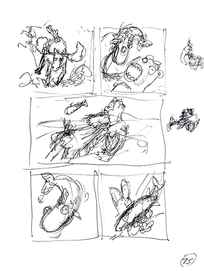
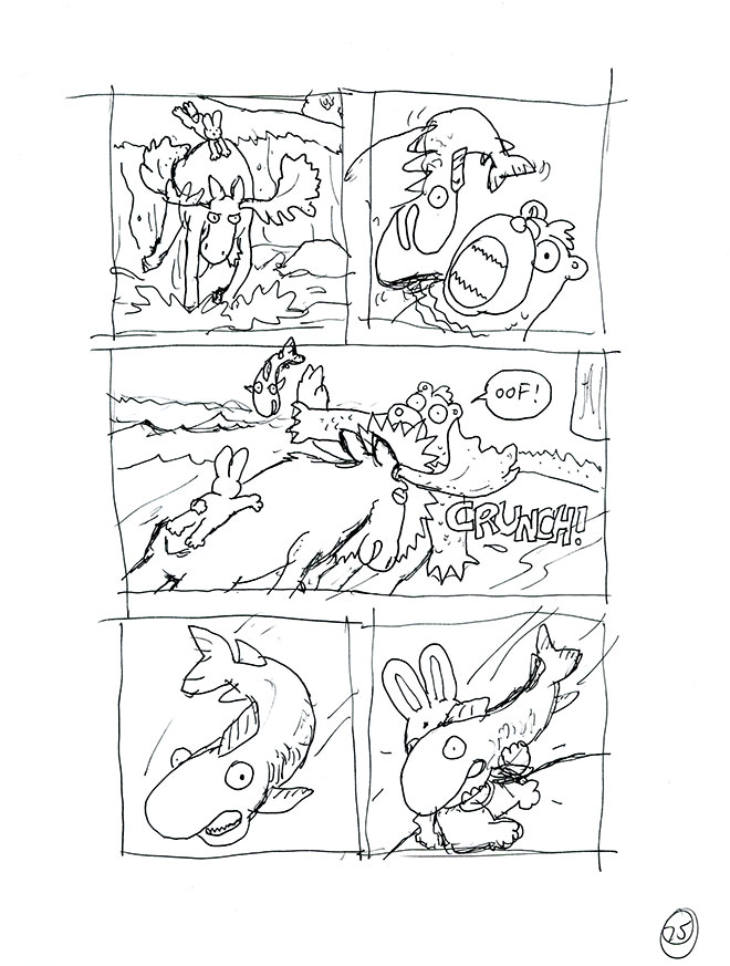
2. The First Scruffy Drawing
Most sensible artists do their early drafts in pencil or on the computer, but I am not sensible. I’m so accustomed to working in ink (thanks to Savage Chickens) that I do my scribbly early drafts in ink too. At this point, I’m just trying to get a sense of where things fit… where the characters are, where the dialogue is going to go, that sort of thing. Here you can see that I’ve already deviated from the script: Once I started drawing, I realized that it would be more fun to give more room to the third panel where Laser Moose hits Aquabear, instead of the first panel.
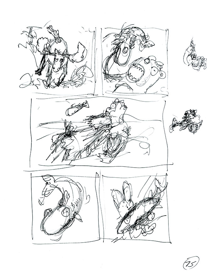
3. Amendments to the Scruffy Drawing
Before I begin refining my original drawing, I might redraw one or two panels that I don’t like the look of. Here, I felt like I needed to explore that important middle panel a little bit more, so I drew new versions on post-it notes and then stuck my favourite onto the page.
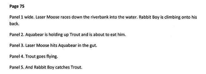
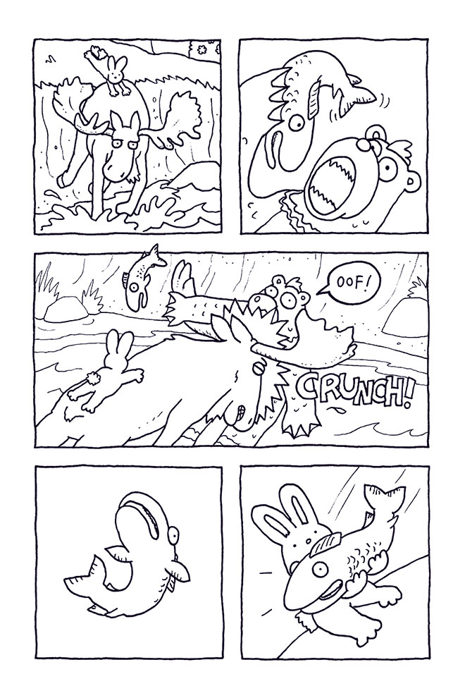
4. The Somewhat-Less-Scruffy Drawing
Now I draw it again, but this one is a little more refined. I’m a bit clearer about where everybody is and where all of their arms and legs are going, and I’ve started to fill in more background detail.
5. The Final Drawing
Those early drafts were drawn on simple printer paper. For the final version, I switch to fancy Bristol paper. Because this is the version that I’ll scan into the computer, and the version that I’ll probably keep forever. This is my last try, so I have to get it right. Here, I’ve realized that I had the background wrong in panel 3 of my early drafts. Because of where the characters were standing, we would see the sloping side of the river, not the grass and trees next to the river. This is why it’s sometimes a good idea to draw little maps of your major settings.
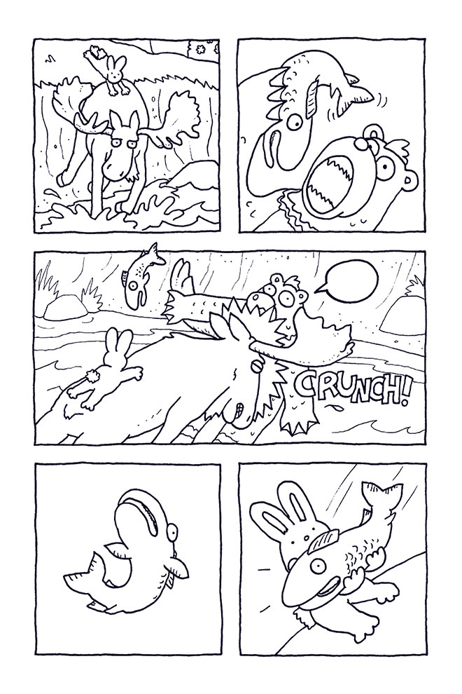
6. Scanning and Cleanup
I scan the final drawing and open it in Photoshop, where I tidy up any little problems like flecks of dust, or maybe a letter “O” that I didn’t draw quite right. Here, I realized that I had forgotten to draw one of Laser Moose’s hooves in panel 1 (!), so I added the missing line in Photoshop. I put the text on a separate layer (for possible translation purposes later, although here I don’t think we need to worry about translating “Oof!”).
6. Time for Some Color
I create a copy of the linework layer so I can add my colors on a separate layer. My colors are stored in a handy Laser Moose palette, with useful names like “Rabbit Boy fur” and “Laser Moose antler” and so on. I use a Photoshop plug-in called Flatten Pro to flatten the colors into a color-only layer without the linework. Then I carefully look for any stray pixels that are the wrong color. The coloring phase is where I’m most likely to seek help from my partner (and colorist), Janet – she understands color combinations better than me, and helps me with tricky things like filters and managing contrast and saturation and all the fancy color stuff.
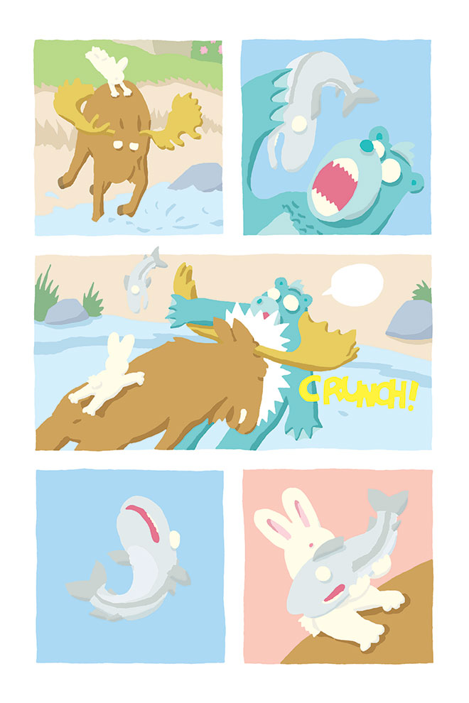
7. The Final Page
With the color sorted out, I make the linework and text layers visible again and that’s it. Finished!
So that’s what I do for all 144 pages. It’s a lot of work! If you have any questions about any of this, contact me or leave a comment here. 🙂
Thank you so much for this detailed look at your process. I’m looking forward to sharing it with my illustration students @ ECUAD. I’m very inspired by your use of ink from the get-go. What kind of pen do you use. 2. Did you trace your final line or is everything freehand?
Thanks Cynthia! So glad that you found this helpful!
I use Staedtler pigment liners (0.5, 0.3, and 0.1). I burn through a lot of them, but I really like the precision of the line. I should have mentioned that I do work on a light box, so I’m always drawing new drafts on top of old drafts.
Let me know if you or your students have any more questions! And I’m always happy to do class visits, especially here in town. 🙂